What's new · 2026.10.10
Easier to read, everywhere
Brand Builder and the Manufacturer Portal now share one look: the Manrope typeface, one brand gold, readable labels and clear form fields.
1The brand typeface finally shows up New
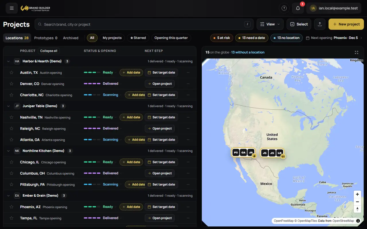
Every screen now uses Manrope, the Concept Services typeface. Until now most computers fell back to their own system font. Headings, tables and buttons read more evenly, and nothing in the app is smaller than 12 pixels.
2Labels and fields you can read at a glance Fixed
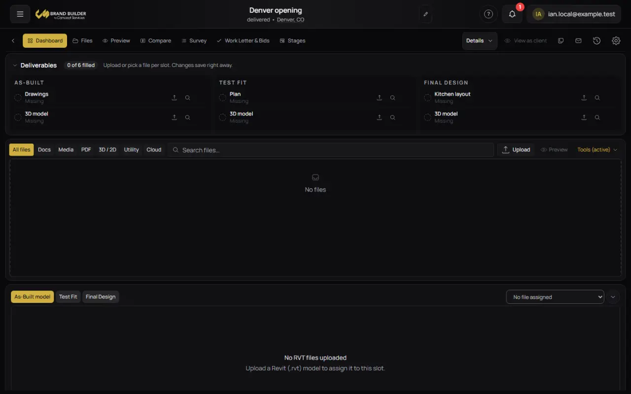
Small grey text such as timestamps, counts and Missing tags is brighter on the dark background. Search boxes and form fields have a visible edge, and the keyboard focus outline is easy to see in Brand Builder and the Manufacturer Portal.
3Manufacturer Portal matches the rest of Concept New
The Manufacturer Portal now uses the same background, sidebar, buttons and gold as Brand Builder, so moving between them feels like one product.
Also in this update
- One brand gold across every app, marketing pages included.
- On a phone, Activity filters scroll away with the page.